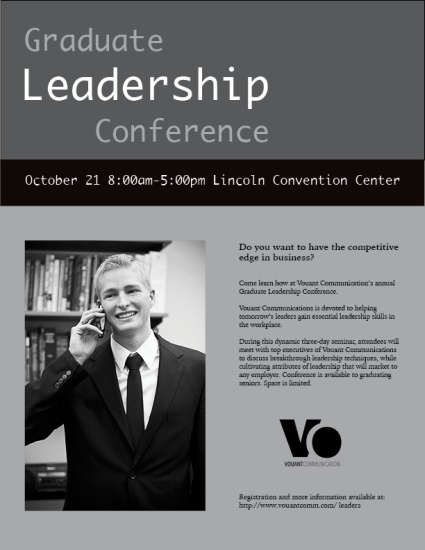
Description:
A promotional flier for a graduate leadership conference in Black and White.
Process:
To get a general idea of how to design my flier I looked at the flier examples online and became more observant to the many designs around me. I created sketches of my own unique fliers that I could potentially create which helped me to figure out which elements I wanted to use when I created this on Adobe InDesign. I made sure that my alignment was straight. Contrast of value was used with the white text on top of a black background to add variations of light and dark.
Message:
I am reaching out to individuals who have recently graduated, to inform them about a leadership conference which can help them to gain an edge in their profession as they become strong leaders.
Audience:
Recent graduates around 22-30 years of age.
Top Thing Learned:
How to use a Mac computer, previous to creating this flier I had only used a PC while learning how to work a Mac computer in doing this I learned how to use Adobe InDesign.
Title Font Name & Category:
Ayuthaya – Sans Serif
Copy Font Name & Category:
Rowan – Old Style
Links to images used in this project:

You used good repetition in the diamonds and triangles. I like the way you made the word “leadership” stand out because of the color contrast you used and it also makes your message clear. Your flier also has some really nice alignment which helps keep everything organized. I like the way you broke up parts of the message and where you place the D-P-T. Great work!
https://jennettenicole85.wordpress.com/2016/05/07/project-1-flier/
https://commbek.wordpress.com/
LikeLike
https://annadaines.wordpress.com/
LikeLike
Nice job!
Excellent job by using all of the colors available from white to grey. I think this really helps your body copy stand out. It looks really tight and neat, very professional. The way you aligned your title with the beginning and end of leadership is great use of alignment. Following that up immediately with the time and place was interesting placement as well, makes it really hard to miss. Good way to get your message across.
https://jonahtaylorproductions.wordpress.com/
LikeLike