Description: Compile an original photograph into a full bleed poster layout therefore demonstrating strong photography and image editing skills.
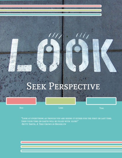
Process (Programs, Tools, Skills: First of all, I formulated a plan for my poster by sketching out basic plans for the layout and photography of my picture. I went outside running with my camera and was able to find this “LOOK” sign on the ground outside of a parking garage, my running shoes have white, teal, and red on them. The original picture did not have much color variation going so my shoes gave me the idea for this color scheme. I took this image on my 5X Wide (Schneider-Kreuznach) 28mm Kodak camera. Next I brought my image into Photoshop and was able to lighten the levels, sharpness, saturation, and color balance. I designed an 8.5×11 layout with my photo, repeating design elements and text included. I used a color wheel from the Visual FOCUS book and used the eye dropper tool to make sure that my image was just right. I had help from individuals and Photoshop tutorials to learn basic elements of Adobe Photoshop such as image editing, typography, organizing layers into folders and designing shapes. After many adjustments my poster came out looking nice.
Message: I wanted to create an inspiring poster encouraging individuals to look at life in a deeper way. I wanted to have a color scheme that would draw students in and would help my photograph to be more engaging.
Audience: The Millennial generation, the generation who have stereotypically been described as a generation always staring down at electronic devices.
Top Thing Learned: I learn about the significance of lighting in Photography and how to use Adobe Photoshop.
Color scheme: Split Complementary: color names: Red, Lime, and Teal
Title Font Name & Category: Photographed directly from ground, similar to Boston Traffic: Sans Serif
Copy Font Name & Category: Andada: Oldstyle
Photograph: Taken Tuesday, May 17, 2016 7:31am
Thumbnail of original, unedited image inserted here:

I loved the color scheme that you used, it matches perfectly with the theme that you picked… I think you did a good job on your photodesign.. I think it has a good alignment and it looks simple but cute, I like it.. you should check my post too https://lagebyui.wordpress.com
LikeLike
Love this! The photo you used is really effective and catches the eye. I like how you tied in the colors. The design elements flow well and make for a really appealing design. I think the colors used at the top are great and your font choice brings it all together.
https://brielleworthen.wordpress.com/2016/05/20/project-3-photodesign/
LikeLike